Explainer videos are great at both showing and telling prospects how your company and solutions will make their lives better. Animations, iconography and voice narration work together to illustrate new or complicated ideas. So it’s essential that you have a clear picture of how the visual elements of your explainer video help tell your story before your project moves into the final phases of production. Here at Autodemo, we include storyboards in our Streamlined Development Process for explainer videos.
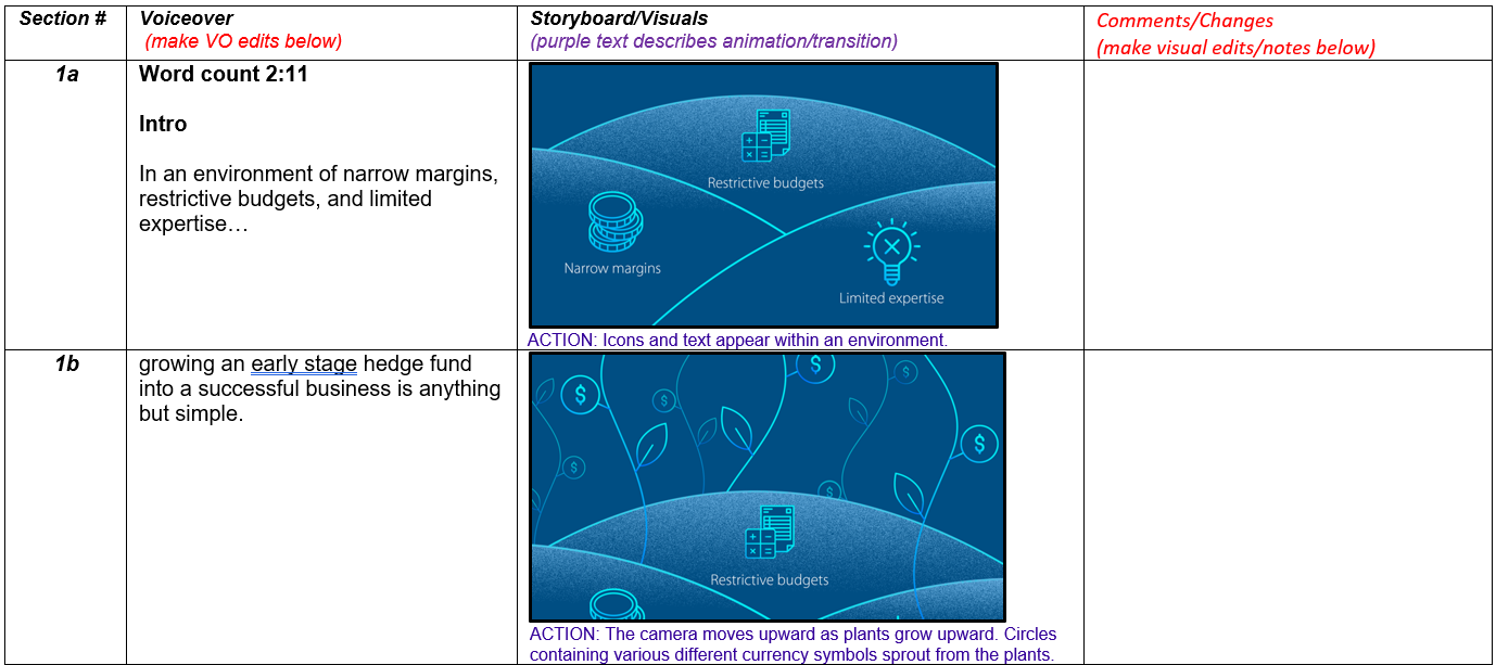
Think of a storyboard as a visual script that gives you a representation of what viewers will see in your final video. A storyboard lays out the visual vocabulary of how illustrations, iconography and visual transitions clarify and augment the information that’s being delivered in the voice narration.
Here’s a look at how we use storyboards in our production process, and how they help make sure your explainer video is clear, concise and most of all compelling.

Explainer storyboards provide a visual preview of your final video
We create storyboards for explainers after approval of the written voiceover script for the project. So we have already established the key points and language that will be used in the video – storyboards let us show you the visual vocabulary and make sure you like the way it tells your story.
We present storyboards in a three-column format.
- The first column contains the approved narration script.
- The second column includes key frames and images that show how we plan to visualize and animate the voice over.
- The third column is dedicated for feedback from our client stakeholders.
Typically, we’ll include somewhere between 15 to 20 key screen images, one for each scene in the video. These screen images illustrate the explainer’s core iconography and imagery, and how animations present information. For example, we might show two or three frames of how an animated flowchart progresses to detail a concept or workflow. We often include an additional “action” notation to provide an even more clear idea of how the explainer video will eventually tell your story.
A chance to refine the nuances of your explainer video
Storyboards are the perfect time for customer feedback on the specific details of how your explainer video will look. In the review process, we look for answers to questions like:
- Do you like the stock photos we’ve selected?
- Which color from your brand-approved palette would you like to use as the base color?
- Is the imagery we’ve selected for key components of your solution on point?
- Can we change the type of graph to increase clarity?
You’ll note that I didn’t mention basic items, like fonts, color scheme, or key brand phrasing for screen annotations. We rely heavily on your existing brand guidelines for such elements, and often use your current site and marketing materials as sources for standard elements. From the very start of our production process, we try to be clear about brand expectations. We lock in what’s important.
And I’ll brag on our team here a bit and say that we’ve gotten pretty good at understanding and explaining the core concepts in all our areas of focus, such as enterprise software. We know how to visualize hyperclouds and data lakes in a way that’s easy to understand.
So customer feedback on storyboards typically centers on subtle preferences – the exact number of nodes on a server, or how to represent a physical space or building. In some cases nuances can include the colors or body shapes we use in iconography for people to reflect our clients’ commitment to diversity or inclusion.
These nuances can extend to gender, body type, height, age – any fine visual detail that you won’t fully appreciate until you see them. Which makes storyboards an invaluable part of the explainer production process.
Explainer storyboards fit into a well-defined production process
As you’ve probably gathered by now, storyboards are a key review phase in our well-defined production process here at Autodemo. They help us ensure that we deliver explainer videos that are on-message, on-schedule and on-budget.
In working with new customers, I do try to stress that storyboards are not a concept pitch, like you might expect from a creative or branding agency. We create one storyboard per project – not multiple versions with different approaches. Don’t expect a pitch deck or an elaborate creative presentation.
A storyboard is a visual realization of a video’ script. It’s the next step in a streamline video production process.
Clear feedback and progress toward a completed explainer video
As with all review steps in our video production process, we ask that the project lead at our client gather feedback from all stakeholders and communicate it directly to the producer here at Autodemo. Requested changes are usually minimal, and we incorporate notes into the beta version of the video that we deliver for the final review.
Of course, if circumstances require it, we can add additional time for reviews with the brand teams or other divisions in your company. But we’ve found that the longer we work with a client, the more seamless our storyboard review process becomes. In fact, we recently eliminated the storyboard review with one client who has come to trust that we will nail their brand and corporate voice every time.
It’s all about quality and efficiency, and storyboards are a key step in accomplishing both those goals.
Explainer storyboards make your message clear
Storyboards are an essential step in ensuring that the visual details of your explainer video support and enhance the message you are delivering to prospects. With a clear understanding of your brand standards and the content of the video already in place, storyboards help refine the visual vocabulary of your explainer video to ensure it engages and informs your target audience.